Commerical Printing: Spot Color & Process Color
Spot Color, Process Color, What’s the Difference?
When you’re describing a color print job to a designer or printer, one of the first things you’ll be asked is if you are using spot color or process color (also called four-color). This terminology is confusing, but he underlying concepts aren’t. Here is a comparison between spot and process colors, and some of the pros and cons of each:
Spot Color
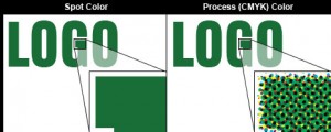
Standard single color print jobs involve printing ink in a color (usually black) on to paper or another surface, usually lighter in color. The process of “screening” the ink onto the paper in tiny dots allows you to use different tints of the same ink. For example, a 50% tint of black gives us grey. This allows us the illusion of a range of colors, while only using a single ink.
When applying a spot color to your print job, you are essentially running the same paper through the press again, using another plate to apply a second color. This additional color can greatly expand the visible range of color in your job. Spot colors can be very tightly controlled (see Pantone Matching, below) and is in general a more economical process than a full-color print job.
Process Color
Process color is often referred to as four-color, because all of the printed content is made up of varying mixtures of four colors – cyan, magenta, yellow, and black. We refer to this as CMYK (black is indicated as K, so as not to confuse it with blue or brown) printing. Using these four primary colors, and one of millions of colors can be created. CMYK printing is particularly useful for photographic reproductions in color.
Four-color printing is more expensive than using spot color. You must either use a digital printing press, or prepare four separate plates to print from. Both of these requirements drive up the cost, but for many applications, four color printing can be the difference between ho-hum marketing and a slick, professional promotional campaign.
Color Matching
Spot colors have an advantage over process colors in that they allow you more control over the precise colors used in your print job. Virtually all printers use the Pantone Matching System (PMS), a standard palette of colors that nail down the precise mixture of ink (fourteen of which are used) to mix a particular sample.
PMS also regulates CMYK colors, but the same level of precision can’t be attained. Many corporations specify their colors by PMS number – for example, Federal Express uses a purple in their logo that is identified as Pantone Color 2685. As a result, any printer anywhere in the world is able to reproduce FedEx’s logo in precisely the right colors. When you use the Pantone Matching System, you can rest assured that the colors you choose are the colors you’ll get. There are CMYK equivalents of PMS colors, but because there are screens involved, they aren’t as accurate as solid spot colors.
Contact us today to get a quotation and discuss your job requirements with the best printer in NYC.

