Trending Colors in Print for 2022
What are some trending colors in print for 2022? In 2021, playful shapes, bright colors, and novel print finishes were trending. However, there is a chance that people will have different color preferences this year. The calm and minimalistic color combination will most likely trend in 2022, especially for posters, packaging, brochures, and magazines. Although optimistic themes are still trending, many businesses will gradually move to a composed approach.

(Source)
Trending Colors in Print for 2022
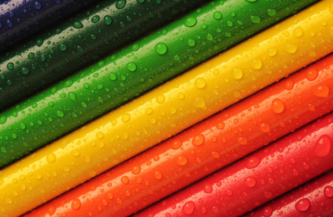
Brands have been focusing on child-like and optimistic colors. They find acid-bright, graphic type, and fluid colors more engaging for packaging, posters, and brochures. These colors are playful, friendly, and attractive. Thus, businesses are choosing these colors with these accents for brochures, posters, and magazines. If you want to follow the color trend for 2022, you can opt for the following color options:
1. Rich, Tonal Colors
Ultra-bright neon and pastels were dominating the designs for a couple of years. But, now marketing teams are shifting towards comforting colors and designs. Neon palates are still common in digital marketing, tonal and rich colors are taking over. These colors are soothing and look incredible with elegant serif typography.
Tonal colors create an effortless and seamless palette for harmonious designs. These color options create warmth and depth for marketing materials. These colors create vibrant effects and eliminate the muted look. For instance, you can use collegiate and autumnal colors for packaging designs. This gives simple but attractive when placed in the retail store. Also, a folkloric and tonal palette enhances the appearance of book covers.
2. Colorful Minimalism
Print designers are bored with simple and sleek colors on minimalistic designs. Thus, they are moving to modernist graphic design with a wide range of colors. Within a year, you will notice these designs everywhere. These colors will give marketing teams a wide range of options to choose from. Whether you print brochures or flyers, you can choose color-pop borders and graphic strips. Designs with a splash of colors will make flyers and brochures more attractive.
3. Black and White
If you think that the black and white color combination is no more a trend, then think again. Many popular brands such as Guess watches are still using this theme for their print media. Colorless brochures and print advertisements engage more audiences. So, if you find it hard to choose the right color palette, you can stay with black and white visuals. But, you should choose the top-grade print quality.
If you think that black and white won’t work with your prints, try changing the texture. Texture plays an important part to bring life to your prints. That’s why monochrome designs are quite popular. UV gloss on the black design will enhance your graphics and logos. Meanwhile, matte and texture prints increase the depth and bring interest in simple monochrome prints. Many book authors use black and white color with texture for their book covers.
4. Subtle Gradients
Brands are getting overwhelmed with acid-bright gradients. However, they lose their freshness. Today, more businesses are choosing subtle gradients to enhance texture. Gentle color gradients in the background improve focus to the product in the center of the frame. People use this color scheme for business cards and other stationery designs.
These color trends when mixed with watercolor effects bring soothing aqueous texture to the print design. This makes this color trend elegant and plays a significant role to grab the attention of the target audience.

(Source)
5. Rustic, Earthy Muted Tones
Soft colors with pastel and muted color spectrum enhance the attraction of the print. Bold colors are no longer trending after dominating the market for a few years. Marketing teams are tired of bright, bold, and brash colors. Thus, they are moving to natural colors for refreshing and calming vibes.
Trending Colors in Print for 2022: Conclusion
Optimistic color designs are still a huge trend but marketing teams are moving towards calm and minimalist color options. Black and white and subtle gradients are perfect examples of trending color options. Furthermore, tactile textures with tonal colors create comfort and attract a potential audience. Also, layered photography creates encompassing and elegant aesthetic.
If you want to follow color trends and boost your brand presence in the industry, you can choose the above color options for print marketing. Furthermore, bright contrast, white space, and modern black improve the aesthetics of your printing options.
A professional printing company understands market trends for brochures, flyers, and other printing materials. They will recommend striking color palates for your marketing materials. If you want to get in touch with a printing company that has 60 years of experience in the field, you can contact Automation Graphics Inc. We offer high-quality printing options to marketing teams with satisfying print quality. If you want to learn more about trending colors and designs, give us a call at 646-205-3037.
